
Gender Switch: Iconic Household Brand Mascots Redesigned
So many household brands that we’ve come to know and love over the years have cemented their place in our home with the addition of a quirky mascot. A defining, relatable character that champions the brand, a familiar face on the shopping aisles of the supermarket – all designed to catch and hold your attention.Generally, you might not give a brand mascot much thought, but when you look past all the bright colours and charisma, there’s one thing that seems to be quite obvious about the bigger picture – where are all the women at?!
Many mascots have been around for decades and as the advertising industry was predominantly male led, branding definitely had a more masculine bias. But, when male brand mascots outnumber female mascots two-to-one, is there still a place for this approach in today’s society?
As new brands forge their way into our homes, it would seem that the industry is in fact moving away from gendered branding in favour of a more neutral approach where gender parity becomes a priority, and rightly so. Women aren’t defined by the colour pink anymore and men like to cook and clean, too.
With this in mind, we asked the question… is there still a place on our shelves for the older, established brand mascots?
With International Women’s Day on the 8th March, we wanted to do something that would cast a light on these outdated brand mascots and level the playing field a little bit. While we certainly don’t want to reinforce female stereotypes, we do want to point out that women are capable of being strong enough to represent cleaning products for tough jobs. They can be mischievous without being sexy and they like to eat food, too…
Toilet Duck
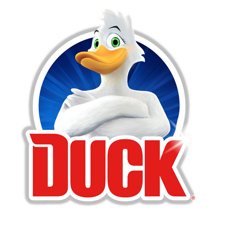
A somewhat household essential, the Toilet Duck brand (and all of its pseudonyms) has held its place in many bathrooms around the world since the early 1980’s. While the branding and mascot for Toilet Duck took a more adrogenous form in the beginning, it actually became more masculine over time, leading to the muscular, imposing incarnation we see today. This almost feels like a backstep on the journey to advertising neutrality.
Mr Muscle
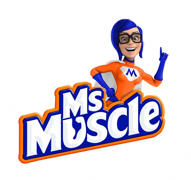
Another household cleaning brand that began life in the 80’s, Mr Muscle was reported to “love the jobs you hate”, backed up by ad campaigns featuring a somewhat effeminate male character eager to get stuck in. Again, over the years, this image has been transformed into a more literal representation of the name and the mascot is now portrayed as a large, muscular male superhero ready to save the day.
Pringles

The stylised cartoon character of “Julius Pringles” has become just as iconic as the saddle-shaped crisps themselves. With his wide moustache and bowtie, the character seemingly represents a traditional gentleman, one that would be in the upper levels of social class – suggesting that Pringles were deserving of a higher status than other crisps.
Green Giant Sweetcorn
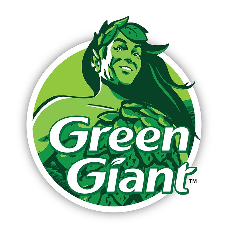
The Jolly Green Giant has represented tinned sweetcorn since the Minnesota Valley Canning Co came up with the concept in the late 1920’s. Since then, little has changed as far as his image goes. A towering figure of strength and typical masculinity, the chiselled jawline and strong legs promote good health, while the colours used signify natural goodness.
But the Jolly Green Giant wasn’t always so jolly. In the early years he wasn’t well received as he was deemed too scary, he had to be “softened” with a sunny smile and a more inviting posture to add a certain level of tenderness to his image.
Rice Krispies
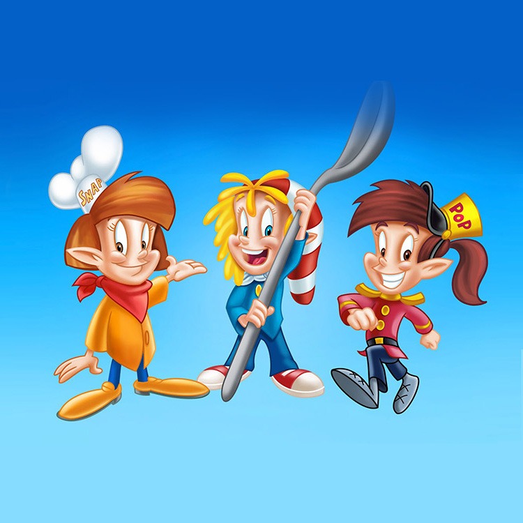
The mischievous elf-like trio known as Snap, Crackle and Pop were created way back in the early 1930’s. But, it wasn’t until the late 1940’s they were reimagined with youthful, more proportional features to appeal to a younger audience.
High energy mischief seems to be their game, but the idea that only boys are capable of this is something of a falsehood. On a side note, it seems that there are very few branded cereals that promote a female mascot, is it time the industry as a whole had a complete overhaul?
Captain Birds Eye
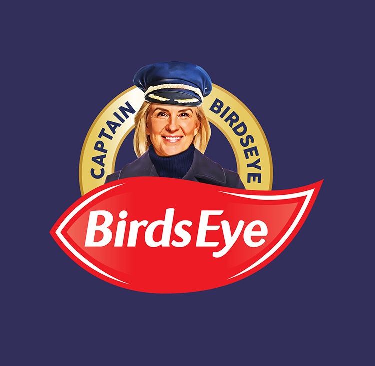
An icon of 1960’s food advertising, the captain has represented frozen food since the brands inception. Generally depicted as a clean living, older sailor with a white beard, it’s a very typical representation of what we’d expect a naval captain to be. These days, the role of captain is no longer reserved just for men and an increasing number of women continue to take up the position.
Frosties
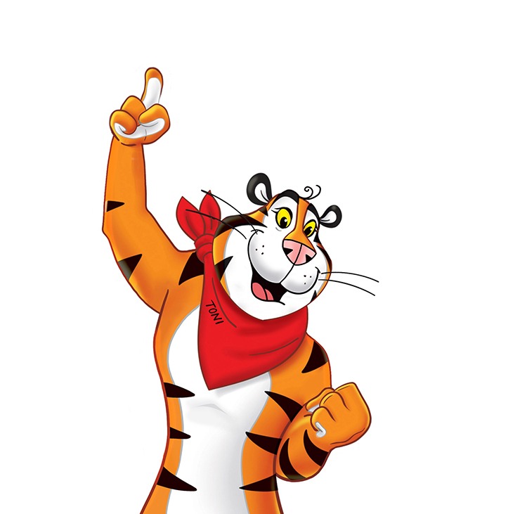
As we mentioned before, the female of the species are seriously underrepresented when it comes to breakfast cereals. Tony the Tiger has become somewhat of an icon since his debut in the early 1950’s. The character we see today was created by a group of former Disney animators, and was the result of a competition run by Kellogg’s to come up with a new mascot for their latest cereal. Interesting fact, that same group of animators also designed The Jolly Green Giant and Snap, Crackle and Pop.
Homepride

Fred the Flour Grader (as is his full name) has been the smiley, bowler hatted mascot for Homepride since his creation in 1964. Promoted as “mums special helper”, he’s seemingly capable of saving any family from meal time woes, the character has even been turned into a range of kitchen products and utensils. Interestingly, Fred had been on a 15 year hiatus until Homepride decided to bring him back in 2014.